
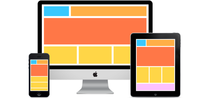
 best resolution for responsive design and ui iphone web template
/* Standard 1024 or larger (browsers) */
@media only screen and (min-width:1024px) {
}
/* standard 1024 or smaller (devices and browser) */
@media only screen and (max-width:1024px) {
}
/* standard pc size 754 (devices and browsers) */
@media only screen and (min-width:768px) and (max-width:1023px) {
}
/* Mobile Landscape Size to Tablet Portrait 520px (devices and browsers) */
@media only screen and (min-width:540px) and (max-width:767px) {
}
/* Mobile Landscape Size to Tablet Portrait 440px (devices and browsers) */
@media only screen and (min-width: 480px) and (max-width:767px) {
}
/* Mobile Portrait Size to Mobile Landscape Size 300px (devices and browsers) */
@media only screen and (max-width:479px) {
}
 Rakesh bagri
100% tested resolution
LikeLike